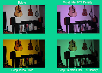
For these edits, I wanted to play with color filters, and see how changing the color of the photo affected it. In my opinion the purple one is the most aesthtically pleasing one, I just find it nice to look at and it makes the photo a bit prettier and calmer. The yellow gives the photo more of a vintage vibe and makes it look like the lighting is warmer. I don't really know how the mood of the photo is affected by the green filter, but I really liked the way it looked and that it gave everything a sort of an underwater feel in a way.

No comments:
Post a Comment