Thursday, June 15, 2017
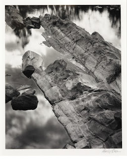
Instrumentalism - Destruction
Friday, May 26, 2017
Alternative Process : Wet Plate Collodion
Alternative Process : Cyanotype
Wednesday, May 24, 2017
Alternative Process : Gum Bichromate
Tuesday, May 2, 2017
Panorama
I took this panorama at the football field outside the school. It's not really exciting but I think it turned out pretty cool. Also Brennan is posing like a natural model on the right so that makes it better.
Layers : Makeup
These photos look really good layered together because they were all taken in the same lighting, and two of them are makeup. They all kind of have a darkish tone to them and I feel like they fit well together.
Friday, April 28, 2017
Layers : Blue
When I made this photo I was focusing on a blue theme because the picture of my friend teeren had a bluish flash, and he was holding the blue doll. I picked a photo with clouds that I really liked and just cropped out the rest. And the pine needles just fit nicely with the two other photos, and I really like how there's a lot of blue and then the small pop of Teeren's red and yellow eyeshadow. I tried a lot of combinations of photos until I finally got something that looked right to me.
Wednesday, April 26, 2017
Layers : Gold
I decided to pair these three photos together because pink and gold are a really pretty color combination. I knew I wanted to put the picture of Teeren and the gold eyeshadow together, but I didn't know what to put as the background. I looked through a bunch of photos that I had taken of flowers and felt like that one went along with it the best.
Friday, April 7, 2017
Grid 1
The theme of this grid is pretty obviously just nature. I went on a walk around my neighborhood during spring break and found a lot of gorgeous things. It was really fun because love being outside and you can really find some cool stuff everywhere.
Grid 2
The theme of this grid is just materials I found around my house. I thought my beat up drumsticks would be a cool subject, and they were. The rest are ordinary objects like a backpack, paper, thumbtacks, makeup brushes, a sweater and a makeup wipe.
Grid 3
The photos in this grid are all related because they're all pictures of parts of the human body. The subjects of the photos are two of my friends, and one of them is myself. I really like the way these photos turned out, I didn't think I'd be able to see that much texture with the macro lens.
Wednesday, March 15, 2017
Shutter Speed and Apertutre
For the shutter speed image, Brennan twirled around in a circle really fast, so I just put it on for one second. I thought it looked funny, and we were having fun with it. The photos for aperture are just my vans with the bleachers in the background because I really like my vans and my socks.
Edit Cluster 4 - Sunny Winter
This is my favorite photo I have ever taken, and editing it was a lot of fun. Saturating the blue made the photo look like a painting to me, and increasing the brightness gave it more of a sunny feel, rather than dark and gloomy. Adding the pink filter was realy cool, and made the photo prettier to look at and kind of fake, but in a neat way. Inverting the colors looks crazy to me, it looks like something you'd see under a microscope. It completely changes the feel and look of the photo, you can't really even tell what the subject matter is.
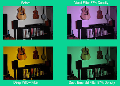
Edit Cluster 3 - Music Gallery
For these edits, I wanted to play with color filters, and see how changing the color of the photo affected it. In my opinion the purple one is the most aesthtically pleasing one, I just find it nice to look at and it makes the photo a bit prettier and calmer. The yellow gives the photo more of a vintage vibe and makes it look like the lighting is warmer. I don't really know how the mood of the photo is affected by the green filter, but I really liked the way it looked and that it gave everything a sort of an underwater feel in a way.
Monday, March 13, 2017
Edit Cluster 2 - Brennan's Shark Hat
In the first edit of this photo I gave it a magenta hue and highly saturated the colors. It gave the image more of a fake, animated feelings since the colors looked so bright and divided. It almost looks like the hat is photoshopped into the photo in front of the pink bricks. In the next edit, I increased the saturation of the yellow and decreased the saturation of the cyan. This gave the photo a more faded look, making the blue less bright and the bricks more noticeable. In the last one, I put a Deep Blue filter and turned up the contrast which made the blues and blacks darker. I did this since it's a shark, and tried to make it look underwater haha get it?
Edit Cluster 1 - Dirty Mirror
For these photos, I played around with filters and saturation of different colors. For the first edit, I decreased the brightness a lot and added more blue into the photo, which saturated the blue of the camera's flash. In the second photo, I made it high brightness and low contrast which gave the photo an overexposed look, and the flash from the camera looks kind of like chemical stains which I thought was neat. And for the last photo, I put a black and white filter, then turned down the saturation of all the colors. This gave it a grainier look that I liked.
Tuesday, February 21, 2017
Wednesday, February 8, 2017
Monday, January 30, 2017
My Mood Photo
I feel like this photo I took of my mom represents shame through the color because of the green and the dark tone of the photo. Green is often used in photos to show stress, envy or shame. Brighter greens could be used for happiness. The darkness of this photo and the fact that she's burying her face in her hands shows that it's not a happy photo. You can see that her hair is greying, which is a sign of aging and stress. When I took this photo my mom wasn't in a very good mood, which made it easier to portray this emotion in the photo.
Friday, January 20, 2017
Mood Shown with Color
Subscribe to:
Comments (Atom)


